Statistics is the New Machine Learning

Machine Learning (ML) is a rapidly developing field. There is enormous competition to be the inventor of a new method that gets widely adopted, and investors stand to make a fortune from a startup that implements a successful new analytical tool. I find it fascinating to watch the emerging hot topics. Recently, I noticed a trend. Hotshot VCs, take note! (But don't get too excited yet.)
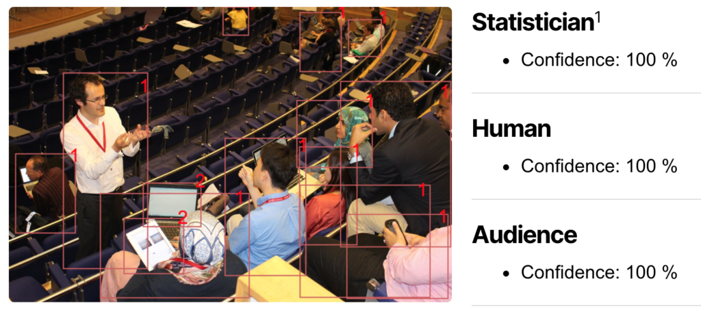
Robert Grant, Statistician, Human, Audience
Robert Grant

First, let's look at some of the latest must-have techniques.

Time series

Me: Hello, old friend. What are you doing here?

Time series: Well, it turned out that not everything in life is a flat file of independent observations, so the ML people called me in.

Me: I thought you'd retired.

Time series: Ha ha ha! No.

H2O.ai, arguably the market leader in automated machine learning (autoML), have this to say right on the front page of their website:

Award-winning Automatic Machine Learning (AutoML) technology to solve the most challenging problems, including Time Series and Natural Language Processing.

Clearly, they think time series is one of the big selling points, or they wouldn't have put it there*. It even bumped the mighty Deep Learning off the Top Two. And perhaps the reason is that those highly flexible and non-linear modelling tools, like XGBoost, take no account of dependency in the data. Looking online for (for example) "XGBoost for market tick data", you'll find plenty of people who still believe you can push any data into a sufficiently flexible algorithm and get a useful model out. Elsewhere, you can find confusion between analysis of streaming data, where sliding windows of time define batches of data, and true time series models. I would argue that, to model data that are grounded in time and/or space, you should also leverage domain knowledge: that's a phrase we'll be hearing again soon.

Vendors working on the data storage and provisioning side have also been quick to offer a range of time-series-aware database products that scale to Big Data. Just search for "scalable time series database" and you'll find plenty. Five years ago it was a concept that you could shoehorn into a more generic type of database, but not a product in itself that could attract investment and get ML pulses racing.

It's hard not to chuckle as a statistician, seeing the ML folk discover autocorrelation 100 years on, but more constructively, this can help us predict where the next ML boom might come. Dependency does not just arise from time-located data, but also spatial data, networks (social or otherwise), heterogeneous data sources, and hierarchical structures. There is a lot of investment in geographical information systems and networks in the machine learning, AI and Big Data world, so it would be reasonable to see this appearing in the near future.

* - that's assuming they didn't tailor the front page for maximum appeal, having already categorised me under Statistics (I jest)

Uncertainty

For a while, ML algorithms became enormously popular on the strength of their predictions (point estimates). Then, unease set in about the lack of uncertainty in the outputs. Suppose you have to produce a categorical prediction. The algorithm returns the category with the best objective function, and that's the only information you have. Some decisions truly are binary (buy gold, sell zinc), while others are fuzzier, but even the binary ones can often be hedged.

In their book Computer Age Statistical Inference, Brad Efron and Trevor Hastie strike a conciliatory tone between statistics and ML, suggesting that most algorithms for data analysis start out with point estimates, and later, uncertainty is added. The EM algorithm is an example.

It was perhaps the rise of self-driving cars that made the absence of uncertainty too uncomfortable. Decisions do not always have to be taken by AI; they can be referred to as the human driver (let's hope they haven't fallen asleep), but that requires a measure of uncertainty. This problem remains imperfectly solved, despite massive investment, and is likely to provide interesting job opportunities for some time to come.

Now, we can see efforts to add measures of uncertainty into ML parameter estimates and predictions. Often, those look a lot like 95% confidence or credible intervals, and there is a big advantage to adding in domain knowledge. Leading software TensorFlow Probability has this to say:

"The TensorFlow team built TFP for data scientists, statisticians, and ML researchers and practitioners who want to encode domain knowledge to understand data and make predictions."

Without statistical (i.e. mathematical models of the uncertainty, based on probability) approaches, adding uncertainty to ML requires re-fitting laborious models many times or adopting some uncomfortable approximation. Any alternative technique that provides a quantified uncertainty output alongside a point estimate, quickly and with well-established long-run properties, is going to be popular with bosses everywhere. Sounds like statistics?

Gaussian processes

These are a class of supervised learning models that use probability but are highly flexible. Taking a starting point from signal processing ideas of the mid-20th century, they envisage the variation in the data to arise from a random process. Between observations, the process moves according to some probability distribution, and Gaussian processes use the normal, or Gaussian, distribution for this, just like Brownian motion. There are also Dirichlet processes for categorical variables.

This necessitates an interesting inversion in conceiving of the estimation and inference problem. Instead of a small number of parameters deterministically leading to a large number of predictions, the data and predictions together are recast as a vector (or higher-dimensional tensor) of values that are subject to the parameters of the underlying process.

The flexibility of Gaussian processes has seen them widely applied to time series and temporo-spatial problems in recent years. For autocorrelation over more than one variable, they are faster and far more robust than the conditionally autoregressive (CAR) models of yesteryear. However, this flexibility comes at a cost, and requires considerable expertise, which remains in extreme short supply. Gaussian processes are mentioned in many data science and ML courses, but usually only at a high level. Their successful implementation requires knowledge of how to choose from the esoteric multi-dimensional priors that they require, and how to tailor these to new settings. Statistical skills, in short!

Bayesian tuning parameter optimisation

There is no free lunch, in statistics as in ML. If you want to input x1, x2, x3, etc and get a prediction of y, you will need to constrain the space of possible models so that there are a number of parameters to estimate. Non-parametric models are sometimes framed as infinite-dimensional, but the essence is the same: choose your method and let the computer find the unknown parameters that can be combined to give an output. This applies to supervised and unsupervised learning equally, because we haven't said anything about the output y being in the dataset along with the x's.

Arising from computer science, many ML methods do not explicitly state a probabilistic model with parameters, but instead try to efficiently and flexibly find a way of converting x's into y. To get that right, there are tuning parameters that need to be set. (Often in ML, they are called hyperparameters, but this has a different meaning in Bayesian statistics, so I will try to avoid ambiguity.) This is generally done by human-in-the-loop experimentation, and more complex (hence flexible) procedures like neural networks can involve many such tuning parameters, which interact with one another. This gives rise to a notion of tuning the algorithm as art rather than science, but recently, there has been much interest in making the tuning part of the process more robust. You can see the problem, for the boss: the entire ML procedure that they have staked their reputation on depends on one geek who knows which buttons to push. That sort of situation keeps bosses awake at night.

Bayesian methods are the buzzword in tuning parameter optimisation. This holds out the promise of even including uncertainty about the tuning parameters in the final inference, although that is not what most ML people mean by Bayesian optimisation. Bayesian sampling algorithms are all about efficiently exploring parameter space to return the distribution of parameter values that fit the data. You can also apply this to explore tuning parameter space, to return the tuning parameters that lead to the best fit. The main difference is that there are only a few "observations" of tuning parameter values that have been tested; it is not a Big Data setting. In fact, it is generally our new friend Gaussian processes that are used as the tuning parameter model.

The ability to automate another part of the ML pipeline means ML engineer jobs being lost, but as always, there is a need for new skills, and those happen to be Bayesian sampling algorithms, probability, uncertainty and modelling small numbers of observations. If only there were a name for this new discipline...

Bayesian updating and windowing

Big Data might have passed the peak on the hype curve, but it remains alluring to many organisations and essential in some settings. Streaming data is a special case, where new data arrive too fast to be included by traditional means. The Covid-19 pandemic has thrown this into focus for many analysts. Epidemiological data, supply chains, and humanitarian aid have all had to be analysed urgently in a rapidly changing problem as data emerge.

The ability to update models rapidly as new data arrive will remain important for some time. That means analysing a new batch of data without having to re-run calculations on old data. In the streaming data paradigm, we might add the new data to a sliding window of time, and remove the oldest data from the window.

Here, Bayesian methods can help, by breaking down the posterior density of the parameters, for which we want estimates and uncertainty, into the product of the prior distribution and a sequence of likelihood functions for each batch.

Although this is alluded to in almost every introductory Bayesian class, it is rarely done because of the difficulty of defining a joint distribution for all unknowns together, and defining its hyperparameters from the posterior sample of the previous batch. Also, the success of the method is contingent on choosing a "right" form of joint distribution, and if you change your mind about it, you must return to the beginning again.

So, in practice, non-parametric updating methods are needed. These do not define a mathematical formula for the prior, but instead use the previous batch's posterior sample to estimate densities and gradients at any new values. This is a topic I have been actively involved in, and which shows promise for Big Data and streaming data settings. However, care has to be taken over the tuning parameters (those little devils again!) and data drift, requiring intensive expert input. It will continue to be a hot topic too, as the volume and velocity of data are only set to grow further.

Explainable AI

Parents everywhere warn their kids that some rowdy game is "fun until someone loses an eye". I have probably said it myself but was too tired at the time to remember. Fitting some complex predictive model to your data, launching it to the public and calling it "AI" is like that too. You're heading for promotion until it gets your employers bad PR because it is inadvertently biased against some group of people. There are many stories of this, and they are often painful to read.

The boss wants an assurance that your AI is "transparent" or "explainable". In other words, they want some best-practice procedure in place that they can cite should the worst happen. And as the boss is the one signing off the software purchase, you can be sure that ML vendors are climbing over each other to add explainability.

There are many ways to do this, which often involve either fitting simpler, interpretable models to the predictions in the locality of the point of interest, or comparing partly matched observations from the dataset. As an output, you can obtain measures of the importance of difference "features" or input variables, and an idea of what predictions would be obtained by perturbing the data. Simpler models, matching, variable importance measures, goodness-of-fit stats, smaller data... I suspect you can see where this is going.

Conclusion

Statistics and ML have often been presented as disparate skill sets, with adherents at loggerheads over which is best. This sort of story-telling gets clicks, but is a gross misrepresentation. Statistics and machine learning are two names for the same thing; they represent two paths by which people have arrived at data analysis: from mathematics or from computer science.

There are some cultural differences, just as Leo Breiman observed in the 2001 paper "Statistical Modeling: the two cultures", but increasing cross-fertilisation of ideas and influences as time goes by. As there is a premium for both groups of people in finding new, effective methods for new problems, we might reasonably expect further convergence.

Once, it was a time of Venn diagrams. Stats and computer science were represented as essential components of data science (whatever that is), along with domain knowledge. There were many variants of these diagrams, increasingly complex and eagerly shared or stolen by bloggers everywhere. A big mistake was introduced when the intersection of the three components was changed from data science to data scientist. These diagrams underwent their own hype curve, inspiring and then disappointing bosses everywhere when they failed to recruit the Unicorn at the centre. But maybe we should think again about the intersection of these three influences. ML has been through a boom time, so to make the next set of advances, wouldn't we expect to see stats and domain knowledge catching up in innovation and in the job market?

This article was written by medical statistician and trainer Robert Grant.

Visit Robert Grant's website.

DISSERTATION SOS: Refresh the Basics of Data Science Software and Make Your Research Shine

Top tips from an academic and expert in the field, Dr. Malvina Marchese.

Which is the secret to a great dissertation?

Writing an excellent dissertation requires a mixture of different skills. As an academic, I have supervised many MSc dissertations and over the years I have found that these are the ultimate 5 things you need to deliver a first class dissertation:

  1. Pin Down the Research Question.Be very clear about what you are investigating so the reader knows what your final goal is from the outset, and can concentrate on understanding your arguments.
  2. Write a Captivating Introduction.You want to strongly demonstrate the importance of your analysis and highlight how your results contribute to the current literature. So ask yourself: do I manage to really show that my hypothesis is supported by the consequential data?
  3. Make Your Data Speak.This is a top skill to show. Master an econometric software and make sure that you present informative descriptive statistics and tables, hypothesis tests and graphs of you data. Let the reader see at a glance the core of your information!  Stata and EViews are great for this with many options to run preliminary tests and to prepare great tables of  your data, as well as many built in data sets to construct your data base.
  4. Master the EconometricsLinear regression? ARIMA ? Panel model with fixed effect or with random effect ? Regime switching models? MIDAS models? Choose the most appropriate model for your research question. Stata and EViews offer easy estimation and very informative output for all the models above and many more. Want help identifying the best model for you? Join our SOS Masters Dissertation help class this Summer in Stata or EViews, where we will learn how to identify the best econometric model to support your findings and how to convince your reader that the model is robust, with a variety of easy to obtain post estimation diagnostic tests.
  5. Make Sure to Discuss the Interpretation of Your Findings.You've got the best model with Stata or EViews, now make sure to discuss the interpretation of your findings and how they support your hypothesis. Which tests should you comment on? Is the R squared really so important? Do you have more convincing information on your software output that you can use to describe? We will learn how to interpret parameters and findings form a wide range of models, to support your conclusions.

Join Dr Marchese for our upcoming SOS Master dissertation masterclasses, with a focus on Stata, and learn how to score the first you're capable of, all whilst enjoying the write up and econometrics!

Full Time Masters and PhD students from academic institutions around the world are eligible to apply for a subsidised place. Find out how to apply for a free spot here. 

Open Data And Policy Evidence Are Here To Stay

Over the first year of Covid-19 in the UK, the demand for data analysis boomed as never before. It seems that more was shared by government departments, agencies and other authoritative sources than ever before. Journalists took this up and news outlets competed to deliver the most up-to-date, meaningful and understandable data-driven content. And critically, the public engaged with data as never before. This transformation of public understanding and appetite for data is here to stay, which means higher standards for transparency around evidence and decision making.

In this article, Robert Grant considers what this will mean for public sector and NGO analysts and decision-makers.

Government

Open data and accountable decision-making are not new, but the public and organisational appetite for data is. This data (or statistics) helps us understand whether policy is justified, and plan for our own circumstances. That places demands on public sector and charitable data sources as never before. Politically, it is very unlikely that the cat will go back into the bag. It no longer seems trustworthy to ask those who are not privy to the data -- the public, companies and smaller public sector organisations -- to follow policy because some unspecified analysis happened on some unspecified data. Only three years ago, it was perfectly feasible for Brexit planning to be based on an expert analysis which the government refused to publish.

If this journey toward open data flows and understanding statistics within the timeframe of covid is a microcosm of a longer term trend, then what is new? Two rapid changes have appeared: a further degree of openness in national official statistics supporting policy decisions, and a critical consumption by first journalists, then the public.

Open data has been an imperative of UK government since the Cabinet Office's white paper on the subject in 2012. Availability has steadily gone up and latency has come down. There is even a requirement to move from static publication formats to interactive, queryable APIs. This has given an opportunity to local organisations with the technical skills in house to create their own tools that draw on national government data. The Open Data Institute has been actively promoting this efficient reuse of data and hosts a variety of case studies on their website.

Before Covid, government data, however much it may have technically been "open", was not something that journalists invested effort into checking and investigating, let alone members of the public.

Over the course of 2020, we saw a gradual expansion of the detail supporting policy decisions, from national to regional to local statistics, and from point predictions to predictions with uncertainty to alternative parallel models. Interestingly, this was not enough for the a parliamentary committee, which issued a public complaint about the government's lack of data sharing and information supporting policy. 

Some topics, like positive test results, were also broken down by age groups to illustrate particular trends. This may have been an exciting new level of transparency, but it quickly became the new normal; when the same granularity was not provided for vaccination statistics, it attracted official complaint from the UK Statistics Authority. It seems that at least this official regulator of government statistics will not be content to return to pre-Covid levels of openness.

The public

However useful the local statistics were, it soon became apparent that infections spread along edges in social networks, which are largely not known to government, and spill over (also in the economic sense) geographical boundaries. The obvious next questions for critical consumers of the stats is "what is MY risk?" There is usually some way in which it is obvious that each of us will differ from the averages for our nation or even neighbourhood, but it is not at all obvious just how much the numbers will change.

The public have grappled with several new concepts such as incidence, prevalence, exponential growth, and competing statistics for diagnostic test accuracy. These are well-known pitfalls for students in medical statistics and epidemiology, and the fact that the public are stumbling across them means that the general level of understanding is rising fast.

By April 2020, there was even a TV comedy show joke about armchair epidemiology. When the public gained the insight to spot poor analyses, the era of the "data bros" was over.

Journalism

In those early days, when there was a lack of information, we also witnessed the phenomenon of "armchair epidemiologists": in the absence of authoritative forecasting early on, anyone with an Excel spreadsheet might produce a compelling-looking forecast, and be taken seriously by those who are searching frantically for any information.

Among the sins committed in this time were fitting normal probability density functions to cases, fitting polynomial curves to cases, and comparing countries on disease burden by counting cases (Monaco is doing really well!). It's easy to laugh at these errors in retrospect (and in possession of a degree in statistics), but each was adopted briefly by, let's just say, prominent organisations (there's nothing to be gained by naming and shaming after we have all learnt so much in a short time). In short, if accountable people who have the data don't communicate, someone else will. And if those in power don't have data either, they might just get pulled in by the allure of certainty.

David Spiegelhalter and Tim Harford, popular translators of complex analyses, were busier than ever explaining and critiquing the numbers. Often, a reframing of the same number brings a new insight. For example, from reporting the number of Covid deaths (hard to contextualise) to the % of deaths which were due to Covid.

"We are four weeks behind Italy" also came from the period (10 March 2020) when we had little information except for some confirmed cases by PCR test, which at the time was only being used on the most seriously ill people. But it had the advantage of narrative and referred to demonstrable, empirical events, and mobilised action in government and concern in the public.

Widespread dispute of, first, the Imperial epidemiological model (16 March 2020), which provided only a point prediction for any given timepoint, and later Patrick Vallance's "illustration" of exponential growth (21 Sep 2020), seem to show an intolerance of prognostication based only on theory without data, while predictions without uncertainty will almost inevitably be wrong. I think this is a new development in public discourse. It must be led by journalism and so, perhaps, comes out of a longer trend in data journalism, data visualisation, and numeracy in the media.

What's next?

The UK has an unusual system for data sharing from government: there is a policy of open data, and an independent statistics regulator. That makes it less likely that this recent trend will be reversed here, though it may be elsewhere. We might expect to see other parts of government, central and local, being held to the same standards, but it is not as simple a comparison as that.

Local government (including public health) have to work hard to build and maintain the infrastructure and systems needed for low-latency, high-quality data. Even where they succeed, local data is small data, which means more noise and more risk of identifying individuals.

Also, there are many aspects of policy-making that elude a simple number, notably, where competing interests have to be balanced. This is more the realm of economics than statistics, to develop utility models of the various harms, benefits and costs accruing to different parts of society in different ways. Even then, the politician is traditionally tasked with making a value judgement to synthesize the evidence.

Beyond the numbers, we have all been confronted with the fact that policy succeeds or fails purely on the extent of public understanding and support, or at least faith. Previously, faith was more the norm than critical querying of the statistics behind policy decisions, not least because the stats were hidden from view, or presented in confusing and, to be honest, boring formats.

Analysts and policy-makers need to be prepared to justify decisions more, whether that's in public health or elsewhere. You should expect your audience to be more critical, more quantitatively minded, and more curious than ever before. Covid-19 did that. But before you fear this new age of scrutiny, remember that they also appreciate your efforts more.

Robert Grant will be presenting the Introduction to Model Building Techniques with Stata, 23 June 2021. How do you know if your models are useful? Or maybe even wrong? This one-day course provides an introduction to the techniques used in model building.

This article is written by Robert Grant, a chartered statistician at BayesCamp.

Robert Grant

Robert's email: robert@bayescamp.com

How to install Python packages into Stata

Written by Chuck Huber (director of statistical outreach - StataCorp).

Using pip to install Python packages

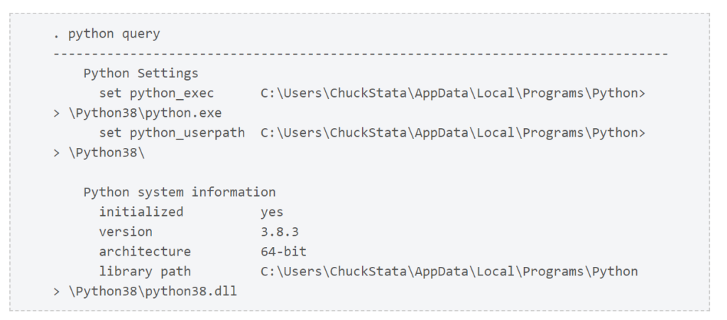
Let’s begin by typing python query to verify that Python is installed on our system and that Stata is set up to use Python.

The results indicate that Stata is set up to use Python 3.8, so we are ready to install packages.

NumPy is a popular package that is described as “the fundamental package for scientific computing with Python”. Many other packages rely on NumPy‘s mathematical features, so let’s begin by installing it. It is possible that NumPy is already installed on my system, and I can check by typing python which numpy in Stata.

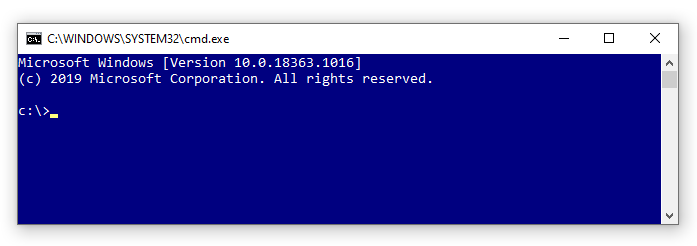
NumPy is not found on my system, so I am going to install it. I am using Windows 10, so I will type shell in Stata to open a Windows Command Prompt.

Figure 1: Windows Command Prompt

shell will also open a terminal in Mac or Linux operating systems. Note that experienced Stata users often type ! rather than the word shell.

Next, I will use a program named pip to install NumPy. You can type pip -V in the Windows Command Prompt or terminal in Mac or Linux to see the version and location of your pip program.

Figure 2: pip version and location

The path for pip is the same as the path returned by python query above. You should verify this if you have multiple versions of Python installed on your system.

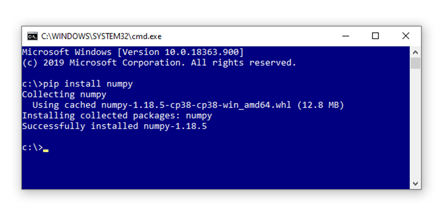
Next, type pip install numpy in the Command Prompt or terminal, and pip will download and install NumPy in the appropriate location on your system.

Figure 3: pip install numpy

The output tells us that NumPy was installed successfully.

We can verify that NumPy was installed successfully by again typing python which numpy

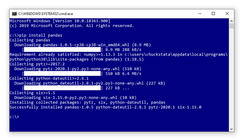
Let’s install three more packages that we will use in the future. Pandas is a popular Python package used for importing, exporting, and manipulating data. We can install it by typing pip install pandas in the Command Prompt.

Figure 4: pip install pandas

You can watch a video that demonstrates how to use pip to install Pandas on the Stata YouTube channel.

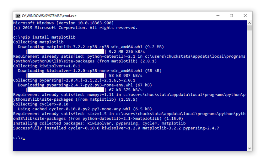
Matplotlib is a popular package that “is a comprehensive library for creating static, animated, and interactive visualizations in Python”. We can install it by typing pip install matplotlib in the Command Prompt.

Figure 5: pip install matplotlib

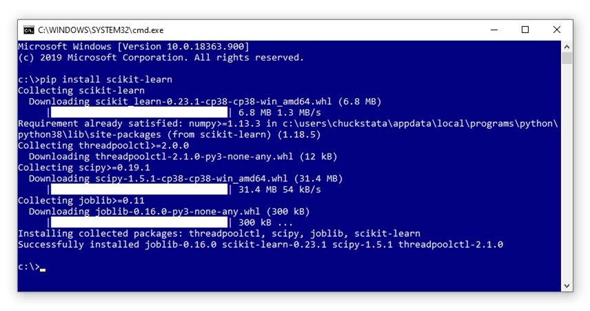
Scikit-learn is a popular package for machine learning. We can install it by typing pip install sklearn in the Command Prompt.

Figure 6: pip install scikit-learn

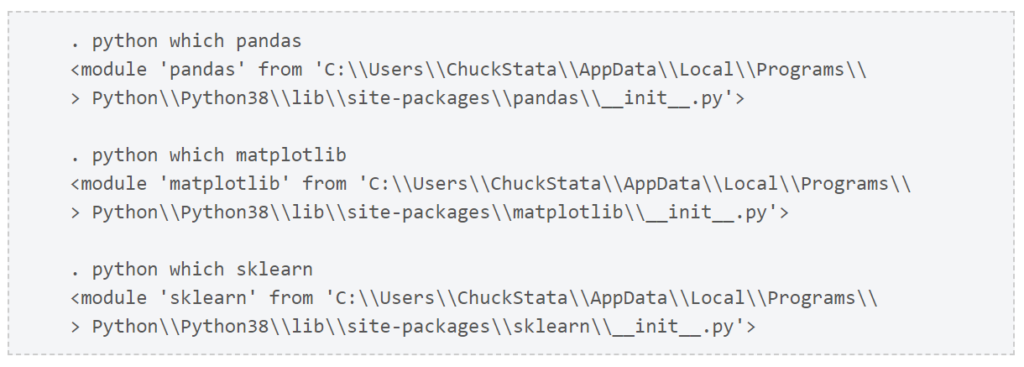
Let’s use python which to verify that pandasmatplotlib, and scikit-learn are installed.

Conclusion

We did it! We successfully installed four of the most popular Python packages using pip. You can use your Internet search engine to find hundreds of other Python packages and install them with pip.

Stata Tips #21 – Stata 15’s new survival analysis with interval-censored event times

Stata 15's new survival analysis with interval-censored event times

What is it for?

Often, time-to-event or survival data are gathered at particular observation times. A physician will detect the recurrence of cancer only when there is a follow-up appointment, and a biologist might know that a study animal in the wild has died when they visit the site, but not exactly when it happened. In either case, all we know is that the even happened between the two appointments or visits, which is to say that there is a lower limit and an upper limit to the survival time. In statistical parlance, data like this are interval-censored.

Stata version 15 includes a new command, stintreg, which provides you with the familiar streg parametric survival regressions, while allowing for interval-censored data. Just by typing estat sbcusum, you obtain test statistics, critical values at 1, 5 and 10 percent, and a cumulative sum (CUSUM) plot, which shows when, and in what way, the assumption is broken if it is.

An example with medical follow-up data

In this post, we'll apply stintreg to a dataset from David Collett's textbook, "Modelling Survival Data in Medical Research" (3rd edition) (Example 9.4). This is from a real-life study that examined breast retraction, a side-effect of breast cancer treatment, and compared women treated with radiotherapy alone and those treated with radiotherapy and chemotherapy. You can download the data in CSV form here and follow along with this do-file.

There are three variables: treatment group, start time of the interval (the last appointment at which there was no sign of retraction) and end time of the interval (the first appointment where there was retraction). First, let's visualise the dataset. Time is on the vertical axis, and the women are ranked by start time from left to right, in the two treatment groups. The exact time when retraction appeared is somewhere in the grey lines. Ideally, we would see a lower risk of retraction as grey lines stretching off to the top of the chart without red dots, and high risk indicated by red dots low down in the chart. But, it is hard to judge whether there are any differences.

Stata graph

Let's fit some streg models, using naive approximations of the data so that they look like they are exactly known. First, we use the start time (the last retraction-free appointment).

gen naive = (end!=.)

stset start, failure(naive)

streg treatment, distribution(weibull)

Stata output

This shows a very strong and statistically significant detrimental effect of chemotherapy. Next, we use the mid-point between the two appointments:

gen naivetime = (start+end)/2

stset naivetime, failure(naive)

streg treatment, distribution(weibull)

Stata output

Oh dear! This shows an almost non-existent difference between the two groups, with no statistical significance. Which can we trust? We need to account for the interval censoring ina principled way, as part of the overall probabilistic model for the data, and this is where stintreg comes in.

stintreg treatment, interval(start end) distribution(weibull)

Stata output

Now, we can see that the treatment group difference is quite large, and quite compelling in terms of significance. Note that, because the models are very different, we can't compare the log-likelihoods.

Why does this matter?

Interval-censored data are everywhere. Being able to account for the uncertainty in the data gives more honest answers, not only by avoiding bias but by having the right level of uncertainty. If you fill in the "blank" with a single number, then you give Stata the false impression that the data are exactly known, and the inferences (p-values, confidence intervals) that follow will be falsely precise as a result.


Stata Tips #20 – Power Analysis

The ultimate question in applied research is: does event A cause event B? The search for causality relationships have pushed applied scientists to rely more and more on field experiments. To be able to detect a treatment effect (or the causality impact), and if setting up an experiment, researchers need to determine the required sample size. Stata 15 has a command power that allows users tremendous flexibility in determining sample size, power of test, and graph those. In the following example we compute sample size for a specific power of test; we could have also computed different powers for a specific sample size.

Assume that we want to calculate the impact of an innovative teaching program on General Equivalency Development (GED) completion rates for a young population (between the age of 17 and 25). In order to do so, we need to run a randomized control trial and randomly pick participants in the innovative program. We know from the literature that the proportion of the population in question with a GED is around 66%. Experts in the education field expects the new program to increase GED completion rates by 20 percentage points (to 86%). How many study participants do we need to test this hypothesis?

Using the command below Stata helps identify the total number of participants (and also the number in each group: treatment and control) needed in the study.

power twoproportions 0.66 0.86, power(0.8) alpha(0.05)

The twoproportions method is used because we are comparing two proportions, 0.66 is the proportion of the population with GED and 0.86 is what we expect the proportion of the population with GED will be after completing the program. power() is the power of the test and alpha() is the significance level of the test; both values here are the default values.

Performing iteration ...

Estimated sample sizes for a two-sample proportions test
Pearson's chi-squared test
Ho: p2 = p1 versus Ha: p2 != p1

Study parameters:

alpha = 0.0500
power = 0.8000
delta = 0.2000 (difference)
p1 = 0.6600
p2 = 0.8600

Estimated sample sizes:

N = 142
N per group = 71

The result of the power analysis tells us that we need to recruit 142 participants into the study in which we enroll 71 in the new program and rely on the remaining 71 as a control group.

Let us say we now want to relax the 0.8 assumption of the power of the test and allow 4 different values ranging from a low of 0.6 to a high of 0.9

power twoproportions 0.66 0.86, power(0.6 0.7 0.8 0.9) alpha(0.05)

Performing iteration ...

Estimated sample sizes for a two-sample proportions test
Pearson's chi-squared test
Ho: p2 = p1 versus Ha: p2 != p1

+-----------------------------------------------------------------+
| alpha power N N1 N2 delta p1 p2 |
|-----------------------------------------------------------------|
| .05 .6 90 45 45 .2 .66 .86 |
| .05 .7 112 56 56 .2 .66 .86 |
| .05 .8 142 71 71 .2 .66 .86 |
| .05 .9 188 94 94 .2 .66 .86 |
+-----------------------------------------------------------------+

The command gives us the sample size of the 4 different scenarios with a low of 90 participants to a high of 188. As expected, the higher the power of the test the larger the sample size that is required.

We can graph the above table using the below command:

power twoproportions 0.66 0.86, power(0.6 0.7 0.8 0.9) alpha(0.05) graph

[Image: Stata output for a multilevel linear regression]

In some cases, the sample size has been predetermined. For a variety of reasons which could eligibility into a program, financial, etc. the number of participants in a study is known and also fixed. In the above example assume the number of participants eligible for the innovative education program is 120. How much power can we detect from the given sample size and a number of different magnitude effects of the program? As a reminder, power of a test is the probability of making a correct decision (in order words to reject the null hypothesis) when the null hypothesis is actually false.

power twoproportions 0.66 (0.71 0.76 0.81 0.86), n(120) alpha(0.05) graph

In the above command, we fix sample size to 120 and suggest 4 different effect sizes each increasing by 5 percentage points from the initial 66% proportion of GED completion rates.

[Image: Stata output for a multilevel linear regression]

The resulting graph suggests low power with the highest being 73% for an effect of 20 percentage points increase in the proportion of GED completion rate. This is not surprising given that the first command gave us a required 142 participants to get the same effect with a power of 80%. With less number of participants, we expect lower power.

Stata Tips #19 – Multilevel Tobit regression models in Stata 15


Multilevel Tobit regression models in Stata 15

Tobit models are made for censored dependent variables, where the value is sometimes only known within a certain range. Chemical sensors may have a lower limit of detection, for example. In this blog post, we'll use some simulated data so that we know what relationships we expect to see, and they will be censored with an upper limit, or as the jargon goes, right-censored.

Tobit models have been available in Stata for a while, but version 15 now includes multilevel versions with random intercepts and random slopes. Let's look at a simple mathematical representation.

[Image: Algebra for the Multilevel Tobit model]

In these equations, i indexes the individual cases and j the clusters of cases that define the multilevel structure. That might be exam results clustered by student, or trees clustered by plantation, or whatever. One neat way of thinking about the advantage of multilevel models is that they split up the unexplained variance into observation-level and cluster-level variance, and in doing so, give deeper understanding and more nuanced conclusions about the data.

x is an independent variable or predictor, y is the dependent variable or outcome of interest, but we don't observe y directly, only y*, which is the censored version at a threshold h. The betas are simple regression coefficients. Then, there is also a random intercept u, which is different for every cluster in the data's multilevel structure, and a random slope v, which contributes to the effect of x on y. The u and v values are normally distributed around zero, by convention.

Simulated data

Let's create some simulated data for an imaginary research study into rehabilitation for amputees learning to use electrically-controlled prosthetic hands. The data are fake but inspired by real-life research.

In these data, there are two training programmes being compared (variable: train) and the participants (identified by the variable: id) are tracked over several weeks (variable: week). They have to complete a test by carrying out four tasks of increasing difficulty (variable: task), and they are timed on the tasks (variable: time), so smaller time is desirable, but there is a maximum time of 30 seconds, so if they have not completed it within 30 seconds, then time is recorded as 30.

This is right-censoring of the dependent variable. We also have to account for the repeated-measures (economists may say "panel data") nature of the data in a multilevel model. There will be a random intercept by id, and a random slope for week, and the study is principally interested in the interaction between week and train, because this would indicate a difference between training programmes in their impact on the rate of recovery (slope relating week to time).

The code to generate these data is in the accompanying do-file. The graphs below show the individual "patients" as lines over time, split by the four tasks and two training groups.

[Image: Outcome versus week for task 1]
[Image: Outcome versus week for task 2]
[Image: Outcome versus week for task 3]
[Image: Outcome versus week for task 4]

If only we knew the real values of the dependent variable...

...then we could just fit a familiar multilevel linear regression. Let's call it "Model 1".

mixed y c.week##i.train i.task || id: week, covariance(unstructured)

You can see that this recovers the population parameters we fed into the simulated data, plus-minus some sampling error. Along with the other two models we'll fit, they are summarised in this table:

[Image: Table of parameters from the three models]

Next, we try the same linear regression, having censored our dependent variable above 30 seconds. The only thing we change is to replace y with ystar, which has any values above 30 replaced with exactly 30. This is "Model 2", and it effectively ignores the censoring, so we shouldn't be too surprised to get biased results out. In the table above, the highlighted cells show those parameters whose Model 1 values lie outside the 95% confidence intervals from Model 2.

mixed ystar c.week##i.train i.task || id: week, covariance(unstructured)

Many of these biases can be understood in terms of the data being pushed down to the red dashed line in the graphs above, and the linear model trying to compensate for that. But, when we use metobit (which has almost identical syntax to mixed) to fit "Model 3", we are asking Stata to integrate out the censored values over the part of the data distribution above the censoring threshold. That requires some assumptions in the model, and of course, this linear and normally distributed dataset fits those assumptions nicely, but in any situation where you are happy to use linear regression with the usual assumption of normal and homoscedastic residuals, it will be justified. Here, the biases of Model 2 all disappear, as seen in the table.

metobit ystar c.week##i.train i.task || id: week, ul(30) covariance(unstructured)

We can use margins and marginsplot to help us interpret the model. You might notice that margins takes much longer with metobit than with mixed: we are asking a much harder task of the computer!

[Image: Stata output for a multilevel linear regression]

From this graph, it's obvious that the bias in Model 2 has been very well removed by the multilevel Tobit in Model 3.


The do-file for this example can be downloaded here.